athmyr - Mia Bickerton
  • Illustration
  • About
  • ILLU6050
  • Illustration
  • About
  • ILLU6050

History & Practice Session IV: Revolution & Early Modernism

21/10/2020

0 Comments

 
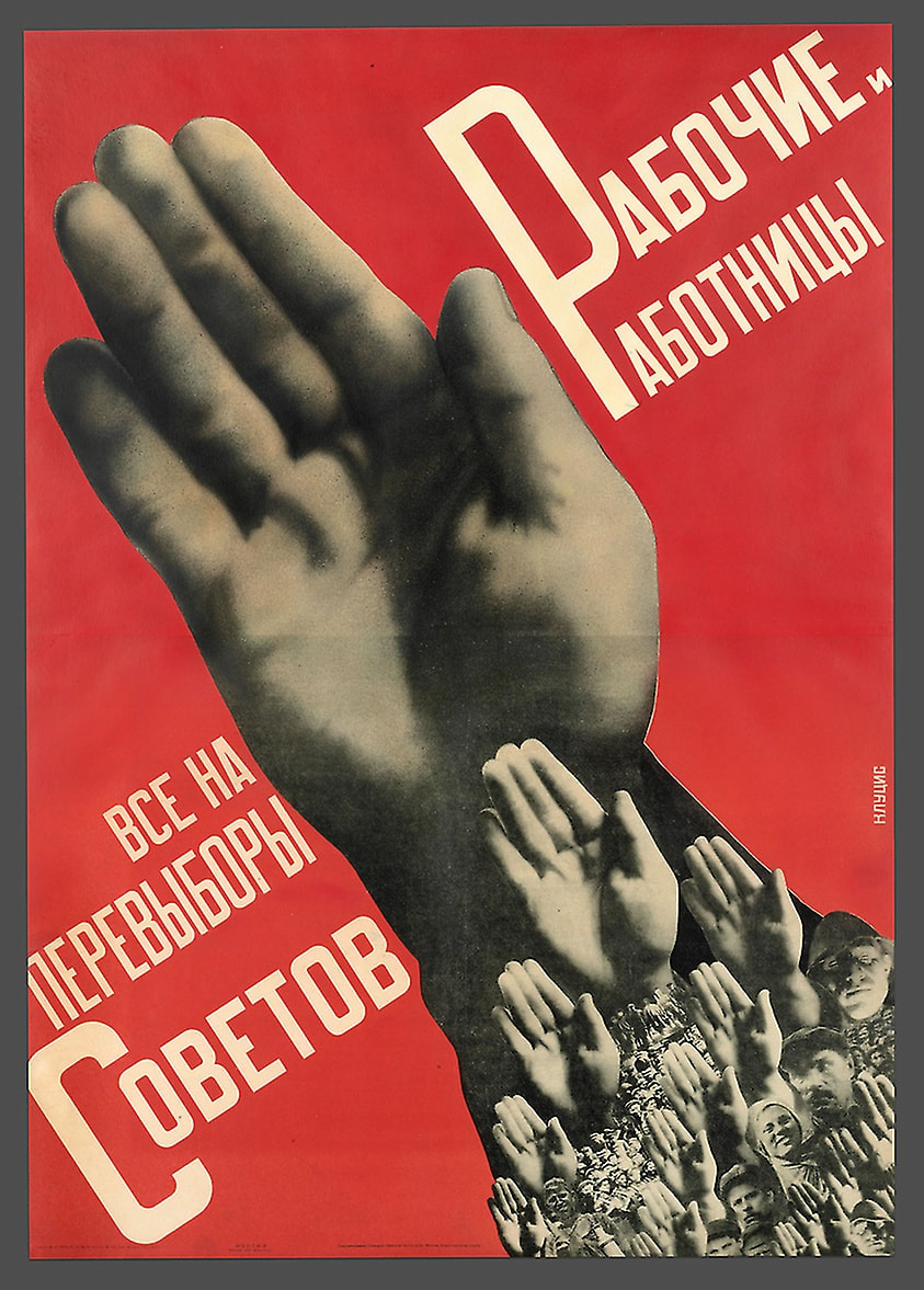
Both constructivists' works have a colour palette of just red, black, and white. This limited use of colour grabs the viewers' attention and helps make a bold statement. These propaganda poster would have been mass produced, making colour printing expensive and it more practical to reduce the variation of colour used.
​A difference between the two posters is Lissitzky's use of shape, creating an abstract composition. This propaganda poster uses the abstract visual language of Suprematism which was founded in 1915 by Kasimir Malevich. Beat the Whites with the Red Wedge was created to support the Bolshevik Red Army's efforts to overcome the anti-communist White Russians. The red triangles can be seen piercing the white circles and rectangles, symbolising the Red Army's victory over the White Russians. The use of text is very minimal as are the shapes, which create a powerful dynamic with the harsh angular lines contrasting with the circles.
​This more abstract design makes the message of the image less obvious upon first glance, yet the choice of colour coinciding with the Red Army and White Russians would have a subconscious impression on its Russian viewer.
Picture
​Gustav Klutsis, Worker Men and Women: Everyone Vote in the Soviet Elections, 1930
Picture
El Lissitzky, Beat the ​Whites with the Red Wedge, 1919
In contrast, Klutsis uses a collage of images for his poster and is known for his development of photomontage techniques as well as for the Stalinist and Soviet revolutionary propaganda he produced with his wife Valentina Kulagina. In the poster Worker Men and Women: Everyone Vote in the Soviet Elections, the main focus is that of a hand with numerous other hands and faces repeated throughout. This creates a sense of unity and power among the people, encouraging viewers to vote in order to stand together and follow along. Having the background as a bright red draws the viewers eye to the centre of the poster which is the main focus.

Both artists use a simple composition of minimal design to help convey their messages to its audience. The limited text makes it faster to get the meaning across to someone just passing by, as they are unlikely to spend the time reading it if there is an excessive amount of writing.
0 Comments


Leave a Reply.

    Mia Bickerton

    Illustrator

    Archives

    December 2020
    November 2020
    October 2020

    Categories

    All
    History & Practice

    RSS Feed

Site powered by Weebly. Managed by 34SP.com