|
Bob Peak
The illustration of the man in the shirt was created as an advertisement for the clothing being worn. By selecting to only detail the shirt rather than the full figure, the viewers main focus can only be on the item being sold which would work great from a marketing point of view. The vivid purple draws the eye to what otherwise would have been just a white shirt. Bernie Fuchs 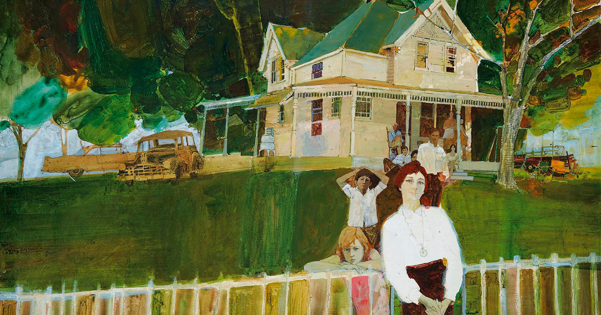 Bernie Fuchs
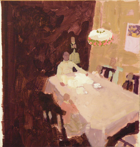
 uses a very selective colour palette for his illustrations that consist of more muted, harmonious colours. This restriction of colour creates an obvious feeling to each painting, with the example on the right conveying a more welcoming and warm atmosphere with its red tones compared to the cold and more hostile atmosphere on the left containing blue tones. Despite this, due to the deep nature of his main tones and lack of any major shading, each painting has an eerie sense to them similar to that of an overcast day. Fuchs has a unique choice of framing when it comes to his compositions, most often choosing to pan away from the main focus of the scene to include more of its surroundings. This gives the viewer a better understanding to the environment of the illustration and giving a further insight to the characters depicted. Practical Task
0 Comments
Leave a Reply. |
Mia BickertonIllustrator Archives
December 2020
Categories |


 RSS Feed