athmyr - Mia Bickerton
  • Illustration
  • About
  • ILLU6050
  • Illustration
  • About
  • ILLU6050

History & Practice Session IV: Revolution & Early Modernism

21/10/2020

0 Comments

 
Both constructivists' works have a colour palette of just red, black, and white. This limited use of colour grabs the viewers' attention and helps make a bold statement. These propaganda poster would have been mass produced, making colour printing expensive and it more practical to reduce the variation of colour used.
​A difference between the two posters is Lissitzky's use of shape, creating an abstract composition. This propaganda poster uses the abstract visual language of Suprematism which was founded in 1915 by Kasimir Malevich. Beat the Whites with the Red Wedge was created to support the Bolshevik Red Army's efforts to overcome the anti-communist White Russians. The red triangles can be seen piercing the white circles and rectangles, symbolising the Red Army's victory over the White Russians. The use of text is very minimal as are the shapes, which create a powerful dynamic with the harsh angular lines contrasting with the circles.
​This more abstract design makes the message of the image less obvious upon first glance, yet the choice of colour coinciding with the Red Army and White Russians would have a subconscious impression on its Russian viewer.
Picture
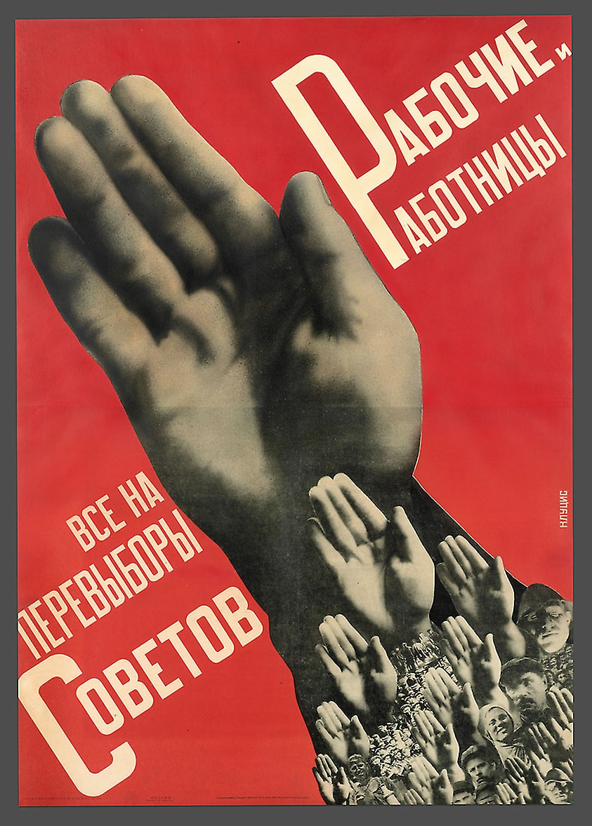
​Gustav Klutsis, Worker Men and Women: Everyone Vote in the Soviet Elections, 1930
Picture
El Lissitzky, Beat the ​Whites with the Red Wedge, 1919
In contrast, Klutsis uses a collage of images for his poster and is known for his development of photomontage techniques as well as for the Stalinist and Soviet revolutionary propaganda he produced with his wife Valentina Kulagina. In the poster Worker Men and Women: Everyone Vote in the Soviet Elections, the main focus is that of a hand with numerous other hands and faces repeated throughout. This creates a sense of unity and power among the people, encouraging viewers to vote in order to stand together and follow along. Having the background as a bright red draws the viewers eye to the centre of the poster which is the main focus.

Both artists use a simple composition of minimal design to help convey their messages to its audience. The limited text makes it faster to get the meaning across to someone just passing by, as they are unlikely to spend the time reading it if there is an excessive amount of writing.
0 Comments

History & Practice Session III: The Fin de Siècle

19/10/2020

0 Comments

 
Art Nouveau
Initially developing from the Arts and Crafts movement in the 1880s, Art Nouveau rejected the traditional Victorian style in order to create something new. The designs became more organic as artists took inspiration from nature and geometry, being widely used in interior design, architecture, graphic art, furniture, textiles, glass art, ceramics, jewellery, and metal work. This movement spread across many countries throughout Europe, with different variations being formed in each city.
​Glasgow
Picture
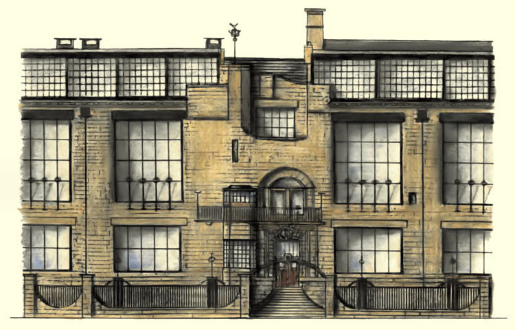
Charles Rennie Mackintosh, Glasgow School of Art, 1896
Lead by the Glasgow Four: Charles Rennie Mackintosh, Margaret Macdonald, Frances Macdonald and Herbert McNair, they founded the later Art Nouveau style with a more geometric influence over a range of mediums inspired by Scottish baronial architecture and Japanese design.
​
Mackintosh began displaying his designs at international exhibitions in London, Turin, and Vienna in 1895. These designs then went on to influence the Secession Style in Vienna.
​Vienna
Picture
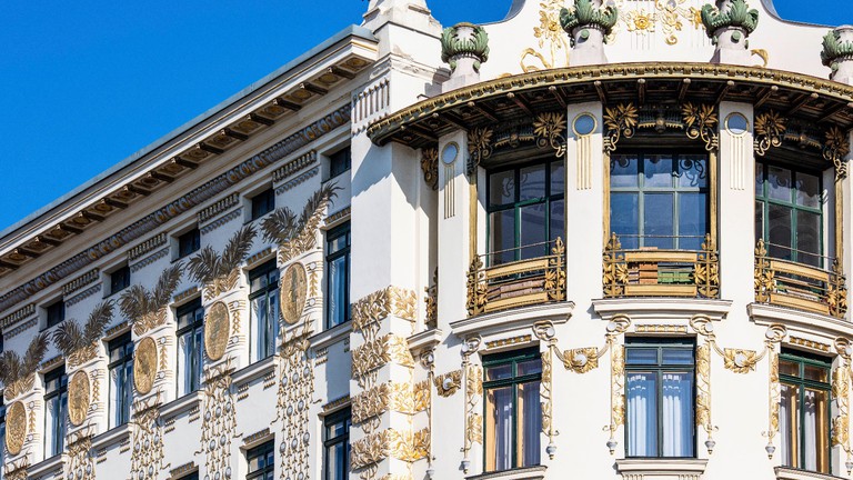
Otto Wagner, The Linke Wienzeile Buildings, 1898-99
Vienna became the centre of a distinct variation of Art Nouveau mainly inspired by geometry known as the Vienna Secession with the movement taking its name from the Munich Secession, a selection of artists that broke away from the mainstream Munich Artists' Association in 1892. The Vienna Secession was founded in 1897 by a large group of artists, with Gustav Klimt becoming the president of the group. They opposed the conservative direction to historicism expressed by the official union of artists, Vienna Künstlerhaus. The Secession went on to found a magazine to promote their work called Ver Sacrum.
​Madrid
Picture
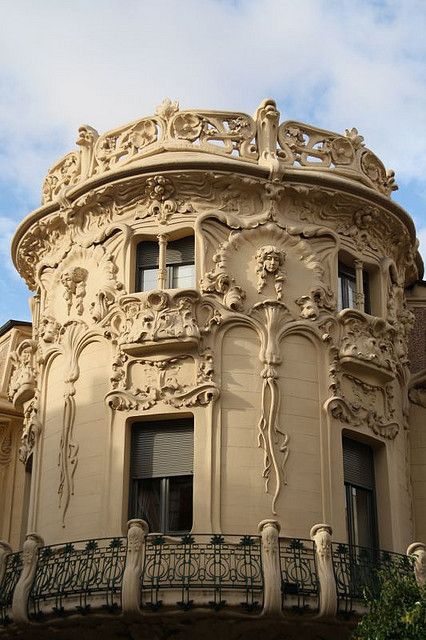
José Grases Riera, Longoria Palace, 1902
Modernismo, the Spanish expression of Art Nouveau, was introduced in Madrid in the early 20th century. Longoria Palace together with the House of Gallardo are Madrid's most notable examples of modernist architecture.

​The design of the palace took inspiration from smooth organic and vegetable forms, interlinking with decorative elements that cover the outside of the building. Some other notable features that convey the Art Nouveau influence would be the incredible iron and glass dome atop the building and the imperial staircase that has a circular outline.
​
​Nancy
Picture
Émile André, Entrance of the Huot house, 1903
​École de Nancy was a Art Nouveau group of artists and designers working in Nancy France from 1890 to 1914 dedicated to upsetting the hierarchy that placed sculpture and painting above decorative arts. The groups work was mainly inspired by nature, consisting of floral forms found in their area. Émile Gallé served as the groups president until his death, being most famous for his incredible glass work and being the driving force behind the Art Nouveau movement.
​
While the Art Nouveau style began to fade across the major European cities, it dominated Nancy's architecture for an additional decade.
0 Comments

History & Practice Session II: Reactions to Victorian Industrialisation

11/10/2020

0 Comments

 
The Influence of Japonisme​​
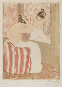
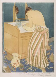
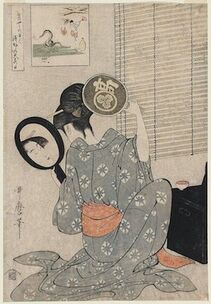
Japonisme began in the mid-19th century, when there was an increased interest in Japanese prints across the West. They began to be sold in many different kinds of stores as well as being exhibited in showcases, most famously the ukiyo-e prints in Paris. Japanese art had a large impact on the direction many artists decided to take with their work after viewing it, heavily influencing and inspiring a new approach. This can be evidently seen from the work American painter Mary Cassatt produced in the 1980's which draw great influence from Japanese artist Kitagawa Utamaro's work.
Picture
Mary Cassatt, Woman Bathing (La Toilette), 1890–91

Picture
Mary Cassatt, The Coiffure, 1890–91
Picture
Kitagawa Utamaro, Takashima Ohisa Using Two Mirrors To Observe Her Coiffure, 1795

​
​Cassatt drew inspiration from Japanese woodblock prints she viewed in the exhibition at the École des Beaux-Arts in Paris. Later going on to exhibit a series of her own coloured prints with The Coiffure being inspired partly by Takashime Ohisa Using Two Mirrors to Observe Her Coiffure, from her personal collection. All three of the prints shown above display a woman in front of a mirror going about her daily life. While Utamaro's work on the right features traditional Japanese items, Cassatt has adapted his style in order to present the daily life of women in France, where she spent most of her life. Despite this clear influence from Utamaro, by doing this she distinctly made the work her own by developing the Japanese style to suit her own compositions rather than simply copying the original exactly. This shows that she understood what made the ukiyo-e prints so distinct however going on to apply this style within a Western context.

Simplifying the forms and colour of the piece inspired by the printing method allowed Cassatt to focus on the story she wanted to tell in the painting with the actions of the woman, making it the clear and distinct focal point.
Picture
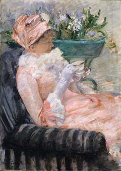
The Cup of Teaca, 1880–81
​Mary Cassatt
In contrast to this, Cassatt's earlier work greatly differs from her artwork inspired by Japan, focusing more on realistic portraits which include great detail and textured brush strokes. Unlike her work inspired directly from Japanese art, she includes a lot of depth with her shading throughout the painting. The painting to the left focuses more on the colours and lighting of the composition rather than the composition itself. The vibrant colours of the woman's outfit convey a glamorous lifestyle, which many women in the 19th century were unlikely to be able to relate to. The normality of the woman displayed in her art inspired by Japan contrasts greatly with this as it shows that the woman in her prints are just the same as everyone else, reflecting the true reality of them being human.

Despite this, her compositions still have similarities. The close framing of her subjects creates a crowded atmosphere despite the limited number of objects in the scene. This choice gives a sense of closeness to the subject as though we are with them rather than just seeing them through a painting, allowing her work a sense of life. Japonisme allowed her to stretch the boundaries of her art, learning to experiment further with how she can produce her work and in what way to go about it.
0 Comments

History & Practice Session I: The Historical Object

6/10/2020

0 Comments

 
The Functions of Clothes:
  • Disguise: visual disguise, modesty, mitigating factors – comfort v impact
    Examples: formal dress/shirt ties, high heels (redistribution of weight)
  • Social Status: controlling devices, role in society, status
    Examples: institutions – military, school, prison uniforms
  • Symbolic Encoding: colour and pattern, mode of communication, creating unity and coherence (textual cohesion), symbolic meaning – culturally significant
  • Personal Expression: identity, expressive qualities, relation, engagement, dressing as pleasure
  • Expressing Allegiance: reflects bias, allegiances, viewpoints, political leanings, clothing as empowerment, signals separation from mainstream
    ​Example: youth subcultures
  • Cultural Markers: culture in flux, consumer culture, global culture, context in important

Picture
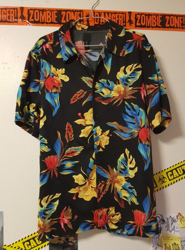
I have chosen to analyse my Hawaiian-style men’s holiday shirt. The shirt is made of 100% lyocell which is a light, breathable material. This is good for this specific shirt as it is designed to be worn in hot weather, and the short sleeves also further improve this function. The material is soft which makes it comfortable to wear in casual use. When it comes to the colour of the garment, due to the bright colours of the flowers being vivid they heavily contrast with the black that is the main colour of the shirt. The black would suggest a more formal and inconspicuous outfit for the summer as most summer clothes are lightly coloured due to their nature of reflecting light and heat. This means that this shirt will absorb heat which could be impractical when trying to keep cool, focusing more on form than function and showing how the influence has transcended its original purpose.
Hawaiian shirts, also known as Aloha shirts, can be traced back to the 1920's and were originally made from colourful Japanese prints. Starting from a Honolulu-based dry goods store, they then went on to become mass-produced throughout Hawaii.

The vibrant primary colours of the flowers create a bold, more eye-catching look which reduces the formality of it and causes the design to be more playful and casual. The shirt is manufactured by H&M and made in China so it is likely to be cheaply produced in order to mass produce clothing and profit from a consumerist culture. This usually means that the items are of a lower quality and not designed to last which is incredibly bad for the environment as society begins to value quantity over quality, creating an excessive waste.

0 Comments

    Mia Bickerton

    Illustrator

    Archives

    December 2020
    November 2020
    October 2020

    Categories

    All
    History & Practice

    RSS Feed

Site powered by Weebly. Managed by 34SP.com