Official culture is made up of widely popular media that reflects mainstream norms and view of the populous of the area. Examples of this would be popular television shows such as Only Fools and Horses and EastEnders with the latter attracting 17.35 million viewers to the launch show and 30.15 million viewers on its Christmas Day episode in 1986. The show was something that many people across England could relate to at the time and helped express their issues in a widely understandable way. In contrast to this, unofficial culture was inspired by the rebellion against the Thatcherite zeitgeist, mainly consisting of smaller groups often located in northern areas of England. This allowed them to revolt against the majority and make themselves heard. In 1981 the Toxteth riots in Liverpool begun due to the accelerating economic decline and overthrow of Labour, with Margaret Thatcher taking over and disregarding the Tory-free zones. An example of unofficial culture in television would be The Young Ones, a British sitcom focused on the lives of four students and their landlord's family, often including surrealist comedy and anarchic humour. The show helped to bring alternative comedy to the BBC in the 1980's, with its rating peaking at 6.5 million viewers.
0 Comments
Martin Sharp
Martin Sharp was an Australian artist and filmmaker born on the 21st of January 1942 in Sydney, Australia. He is most famously known for his distinctive 1960's music posters, many of which featuring popular musicians such as Donovan and Bob Dylan. Sharp used a mixture of photographs, cartoon figures, and embedded letters, all brought together with his psychedelic patterns in the illustrations he produced. Upon moving to London in 1966, Sharp became an artistic director for the popular satirical magazine Oz, where he gained national attention for his work.
Sharp was inspired by his favourite artists, Van Gogh, Magritte, Matisse and Hokusai, including a strong influence from the music he greatly appreciated throughout the 60s. He was drawn to a particular artist known as Tiny Tim, a performer that played the ukulele and sang in a falsetto voice. He was fascinated by the language of art, of which he could mix and connect things, such as his combination of a Magritte still life within a Van Gogh landscape which was featured in his simply titled Art Book published in 1972.
Many of Sharp's illustrations incorporate images from many classic paintings, from Mona Lisa by Leonardo da Vinci to The Starry Night by Vincent van Gogh. While studying art at school, Sharp was awarded a book about Vincent Van Gogh as an art prize which provoked a lifelong fascination with the painter. He went on to rework many of Van Gogh's paintings into his own work, developing them into his own distinctive works. The illustration shown below on the left, Still Life: Marilyn, is directly inspired by both Vincent van Gogh and Andy Warhol. Sharp collaged two of their most famous works, Sunflowers and Green Marilyn, to create a unique surrealist piece before later going on to paint it. Sharp stated that the collage was only possible due to Marilyn's green eye-shadow matching the green of the background of the sunflowers, signifying that the influence of both artists still lived and influencing the title of the piece.
Through this clear dedication to Vincent van Gogh’s work, the influence he had over Martin Sharp’s work is evident. This is further emphasised in Sharp’s rendition of The Road to Tarascon, a painting originally created by Van Gogh in 1888, using his own unique cartoonist style for Oz magazine and going as far as to name it the same. While the basic composition of the two artworks below are the same from the figures pose to the shadow, they convey a very different atmosphere with their individual colour palettes and style in which they were produced.
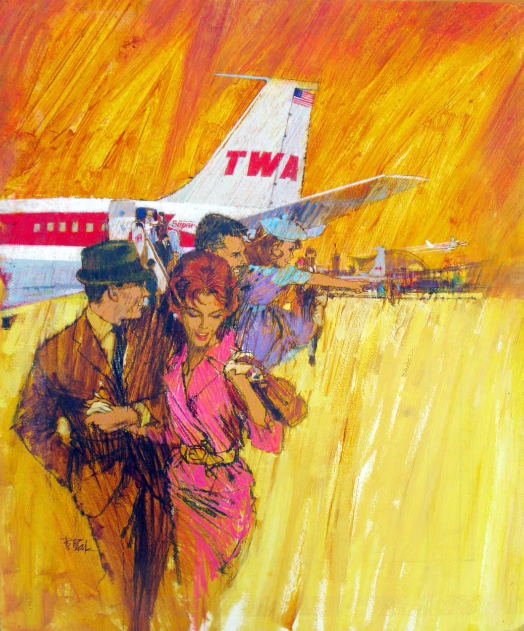
Bob Peak
The illustration of the man in the shirt was created as an advertisement for the clothing being worn. By selecting to only detail the shirt rather than the full figure, the viewers main focus can only be on the item being sold which would work great from a marketing point of view. The vivid purple draws the eye to what otherwise would have been just a white shirt. Bernie Fuchs 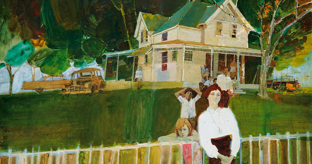 Bernie Fuchs
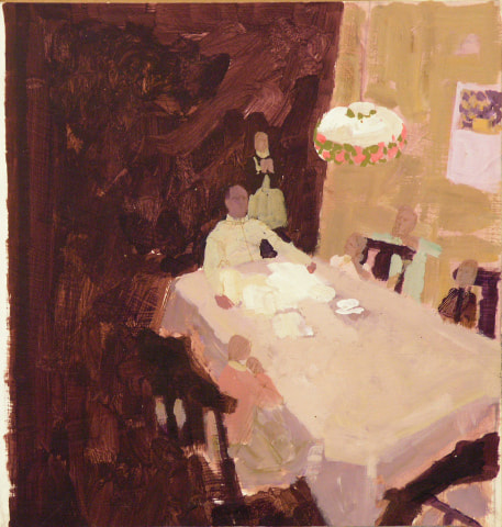
 uses a very selective colour palette for his illustrations that consist of more muted, harmonious colours. This restriction of colour creates an obvious feeling to each painting, with the example on the right conveying a more welcoming and warm atmosphere with its red tones compared to the cold and more hostile atmosphere on the left containing blue tones. Despite this, due to the deep nature of his main tones and lack of any major shading, each painting has an eerie sense to them similar to that of an overcast day. Fuchs has a unique choice of framing when it comes to his compositions, most often choosing to pan away from the main focus of the scene to include more of its surroundings. This gives the viewer a better understanding to the environment of the illustration and giving a further insight to the characters depicted. Practical Task
Esquire
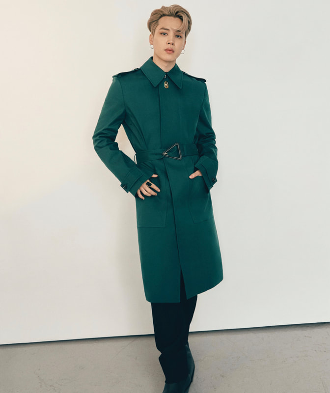
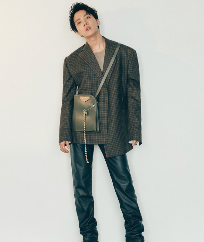
Some of the outfits included in the shoot feature clothing styled in what would be considered traditionally feminine. BTS are notorious for breaking gender norms with their fashion choices, making them an ideal choice for this article to help forward the movement. With the increasing representation fighting against the toxic masculinity in the media, it helps dispel the stigma of men wanting to express themselves in a less traditionally masculine way to a point where in future it could become the norm.
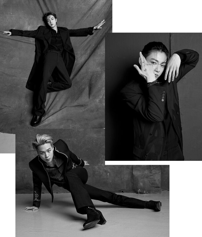
The photoshoot images taken for the article show the members of the band with the majority of them wearing clothing from different popular fashion brands, showcasing the recent movement of 70's style fashion making a return. The photos taken show the fluidity of the models, capturing movement in the images. The choice of making the photographs black and white creates a sense of sophistication and historical importance. In addition, this decision further emphasizes the return to more vintage trends due to black and white photographs being mainly associated to the times before colour film was invented. The individual shots of the models are collaged together, further emphasizing the movement within and reflecting the global movement they are creating. There are two locations used when it come to this photoshoot, a clear alleyway and an empty studio. The simplicity of the locations focuses the viewers' attention on the models in the image rather than their surroundings. The bare walls of inside the building further emphasise the vintage theme and rustic tone. Vogue
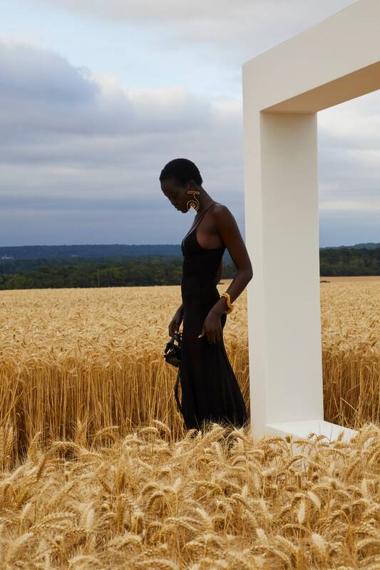
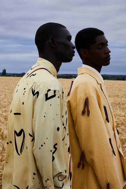
The choice to move the Spring show out to a village known for its fertile soil for farming allowed incredibly picturesque shots to be taken, bringing life and nature to the runway. The endless fields of wheat add a rural feel to the clothing, as though they belong there in that environment. By bringing the fashion out to open land, it evokes ideas of freedom and discovery reminiscent of times pre-covid giving hope that this is the beginning of its return. 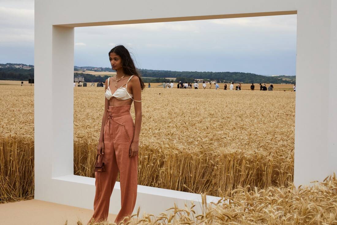 The models selected show diversity, something that is not particularly well represented in the fashion industry and helps the brand feel more inclusive to its viewers. The simple white rectangle helps frame the models as though they were in a painting, encapsulating them into their own world.
Rather than the yellow clothing getting lost in the similar toned field, it further emphases those bright tones of the fabric. The dark blue of the sky adds to the contrast of the soft yellows, bringing them to the forefront of the image.
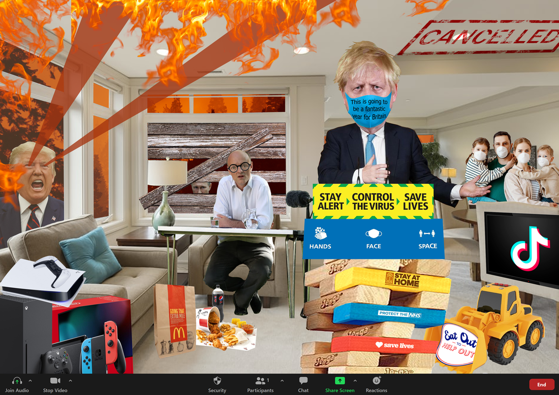
I chose to include Boris Johnson at a lectern built from Jenga blocks, made up of the many phrases that the government have put out, to commentate on the instability of his approach to this pandemic as well as the lack of serious action he has taken which has made people unsure of the future and what it will hold. In addition to this the bulldozer represents how their many schemes, such as 'eat out to help out', that try to help the economy have put people's lives in danger and gone against all their previous slogans.
The overlay of the zoom call seen at the bottom of the image shows how video calls have become a more commonly used thing throughout all households, keeping people connected maybe now more than ever showing that despite all the bad things there can be positives drawn from them. I decided to put all these political references within the home living room as the news is something you cannot escape in daily life with it being something you view both on the television and mobile phones, it effects all aspects of life. Max Bill
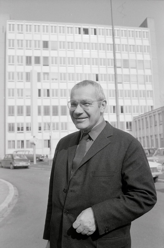
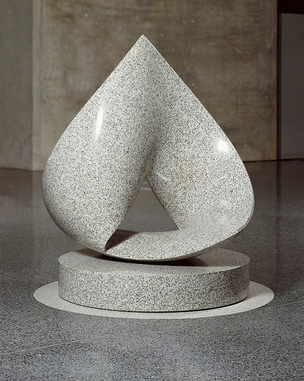
As a designer and artist he wanted to create forms that visually represented the New Physics of the early 20th century, creating objects so that the new science of form could be understood by the senses. This is known as Concrete Art, an art movement with an emphasis on geometrical abstraction.
Bill became a professor in 1944 at the Kunstgewerbeschule Zürich, specializing in Design and Typography. He later went on to found the Ulm School of Design in 1953 alongside Inge Aicher-Scholl and Otl Aicher in Germany with Bill designing the building. This design school was originally created in the tradition of the Bauhaus but later developed a new approach of integrating art and science. Bill was the first rector of the school, although he later resigned is 1956 due to changes in the teaching approach that the design school had taken, favouring the traditional Bauhaus teaching approach. He continued to teach until finally leaving the school in 1957. Additionally to teaching, Bill wrote and lectured extensively on art, architecture, and design. He appeared at many design conferences around the world and wrote books about artistic theory. In 1982 he received the Sir Misha Black award and was added to the College of Medallists. He died on the 9th of December 1994.
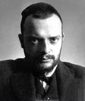
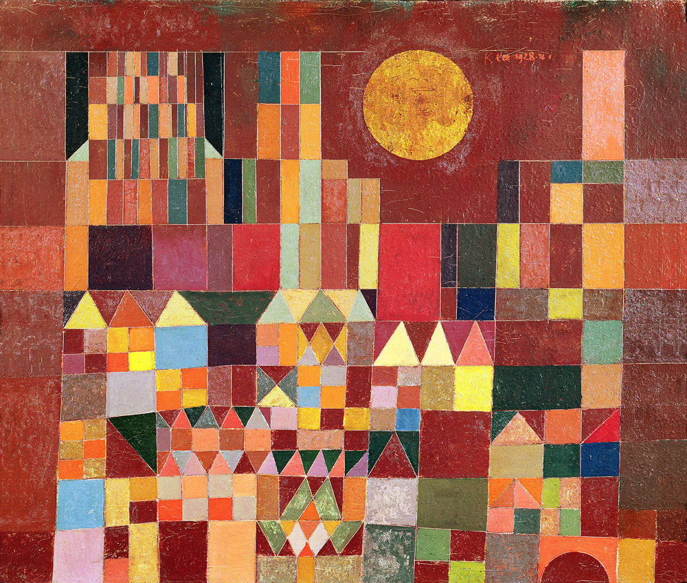
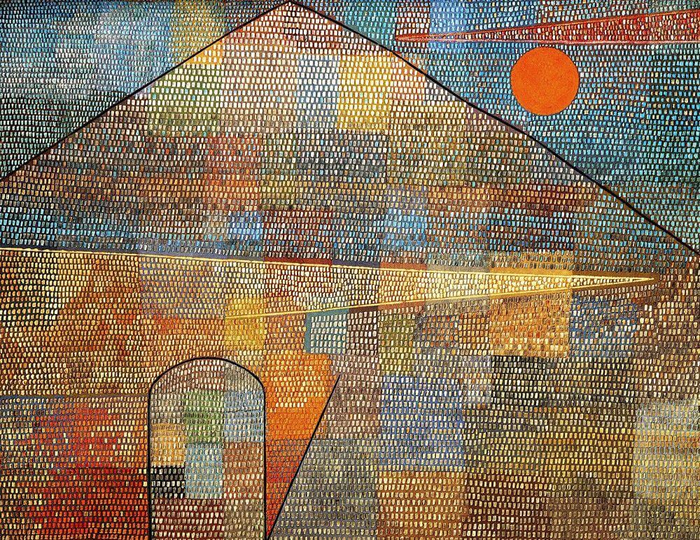
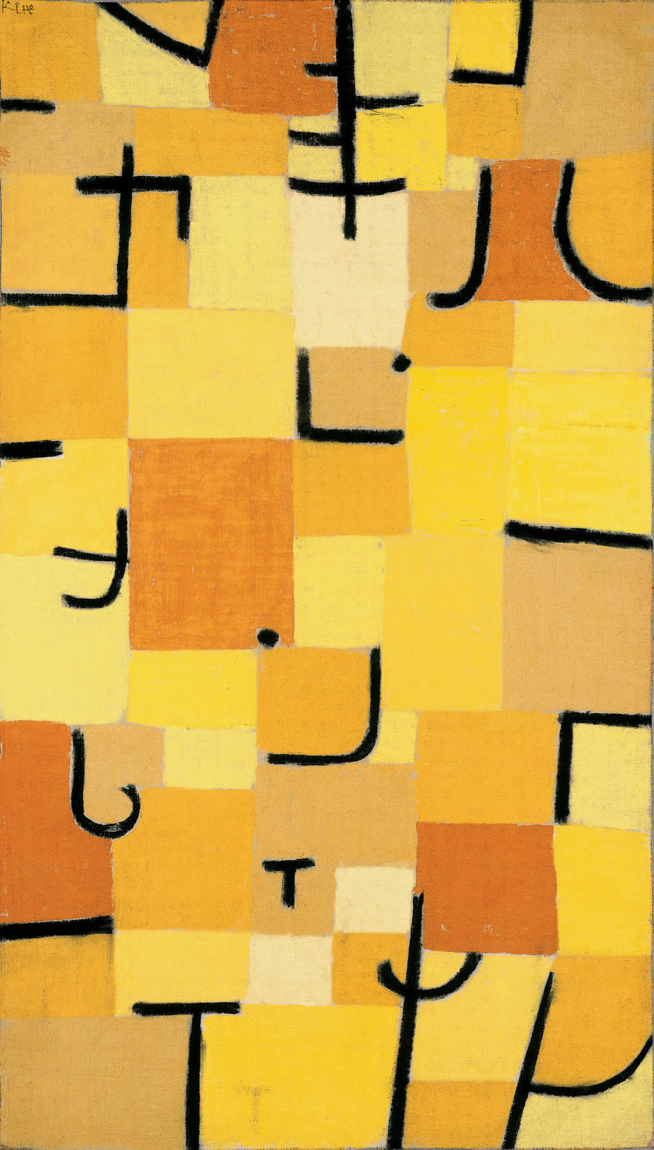
Paul Klee
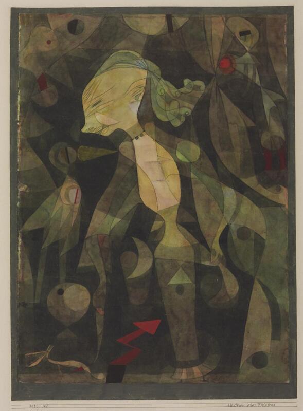
Influenced by art movements including expressionism, cubism, and surrealism, Klee experimented with and deeply explored colour theory. Lacking any natural colour sense, this was something he sought to work on throughout his life. He wrote about it extensively, having his lectures Writings on Form and Design Theory published as the Paul Klee Notebooks in English, with these writings being held with great importance for modern art. Klee taught at the Bauhaus school of art, design and architecture in Germany from 1921 to 1931 alongside his colleague Wassily Kandinsky, a Russian painter, who was an old acquaintance of Klee's. He was a master in the bookbinding, mural painting, and stained glass workshops.
Klee generally worked in isolation from his peers which allowed him to interpret trends in his own way. Many of his works have a child-like quality, with him often using geometric forms combined with figures of people and animals, while other works were completely abstract. His works reflect his dry humour and mood, which are not only seen in the artwork itself but also their titles. With his death on the 29th of June 1940, his legacy comprises of around 9,000 works of art. Suffering toward the end of his life due to an autoimmune disease, his last works of art reflect this pain and give an insight to his emotions and feelings at the time.
Both constructivists' works have a colour palette of just red, black, and white. This limited use of colour grabs the viewers' attention and helps make a bold statement. These propaganda poster would have been mass produced, making colour printing expensive and it more practical to reduce the variation of colour used.
Art Nouveau Initially developing from the Arts and Crafts movement in the 1880s, Art Nouveau rejected the traditional Victorian style in order to create something new. The designs became more organic as artists took inspiration from nature and geometry, being widely used in interior design, architecture, graphic art, furniture, textiles, glass art, ceramics, jewellery, and metal work. This movement spread across many countries throughout Europe, with different variations being formed in each city. Glasgow
Vienna
Madrid
Nancy
The Influence of Japonisme Japonisme began in the mid-19th century, when there was an increased interest in Japanese prints across the West. They began to be sold in many different kinds of stores as well as being exhibited in showcases, most famously the ukiyo-e prints in Paris. Japanese art had a large impact on the direction many artists decided to take with their work after viewing it, heavily influencing and inspiring a new approach. This can be evidently seen from the work American painter Mary Cassatt produced in the 1980's which draw great influence from Japanese artist Kitagawa Utamaro's work.
Cassatt drew inspiration from Japanese woodblock prints she viewed in the exhibition at the École des Beaux-Arts in Paris. Later going on to exhibit a series of her own coloured prints with The Coiffure being inspired partly by Takashime Ohisa Using Two Mirrors to Observe Her Coiffure, from her personal collection. All three of the prints shown above display a woman in front of a mirror going about her daily life. While Utamaro's work on the right features traditional Japanese items, Cassatt has adapted his style in order to present the daily life of women in France, where she spent most of her life. Despite this clear influence from Utamaro, by doing this she distinctly made the work her own by developing the Japanese style to suit her own compositions rather than simply copying the original exactly. This shows that she understood what made the ukiyo-e prints so distinct however going on to apply this style within a Western context. Simplifying the forms and colour of the piece inspired by the printing method allowed Cassatt to focus on the story she wanted to tell in the painting with the actions of the woman, making it the clear and distinct focal point.
Despite this, her compositions still have similarities. The close framing of her subjects creates a crowded atmosphere despite the limited number of objects in the scene. This choice gives a sense of closeness to the subject as though we are with them rather than just seeing them through a painting, allowing her work a sense of life. Japonisme allowed her to stretch the boundaries of her art, learning to experiment further with how she can produce her work and in what way to go about it.
The Functions of Clothes:
Hawaiian shirts, also known as Aloha shirts, can be traced back to the 1920's and were originally made from colourful Japanese prints. Starting from a Honolulu-based dry goods store, they then went on to become mass-produced throughout Hawaii.
The vibrant primary colours of the flowers create a bold, more eye-catching look which reduces the formality of it and causes the design to be more playful and casual. The shirt is manufactured by H&M and made in China so it is likely to be cheaply produced in order to mass produce clothing and profit from a consumerist culture. This usually means that the items are of a lower quality and not designed to last which is incredibly bad for the environment as society begins to value quantity over quality, creating an excessive waste. |
Mia BickertonIllustrator Archives
December 2020
Categories |


 RSS Feed